woofie
The bittersweet sweets brand "woofie," themed around caramel and nuts, has opened in the JR Shinjuku Station's underground commercial facility "EATo LUMINE." Responsible for the overall planning, art direction, and design, including product development, logo, packaging, store design, and uniforms. Despite its appearance, it's a bittersweet sweets brand that offers a slightly adult taste. The dog "Woofie" staring at its reflection in the water symbolizes the extreme contrasts of "bitter" and "sweet" flavors.

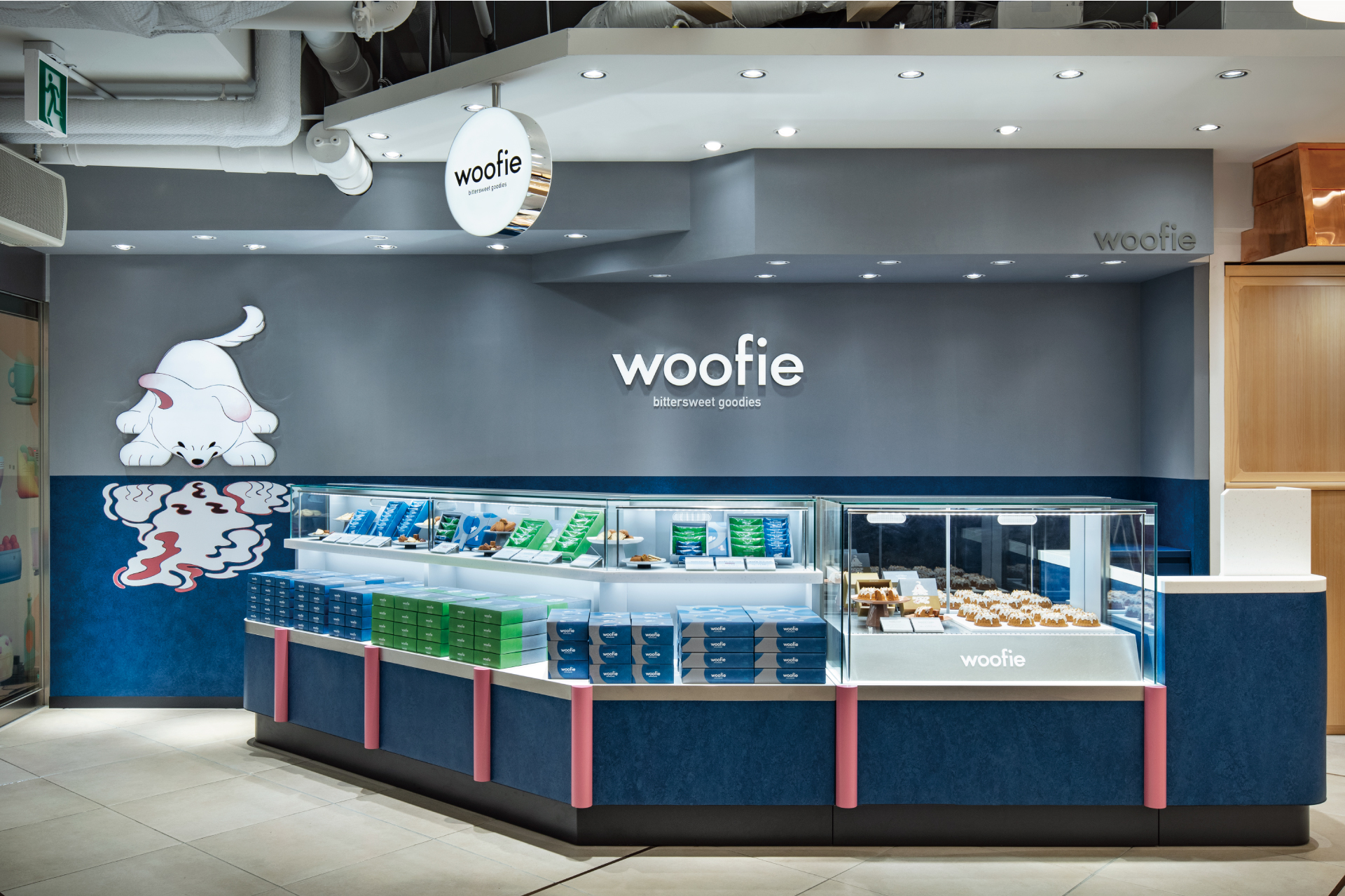

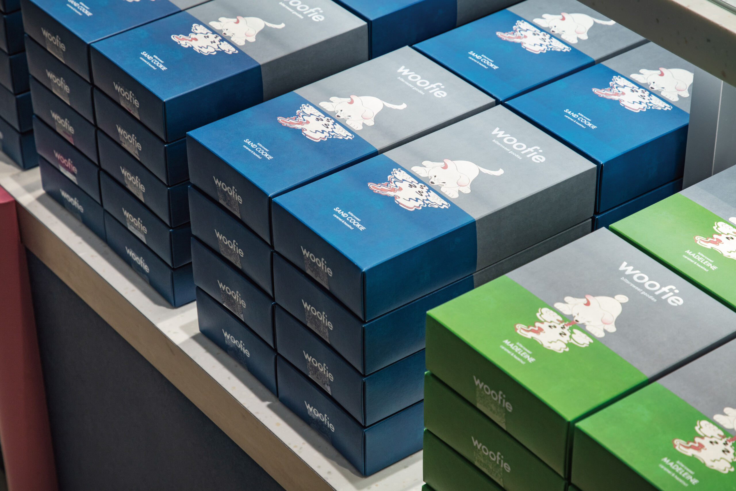
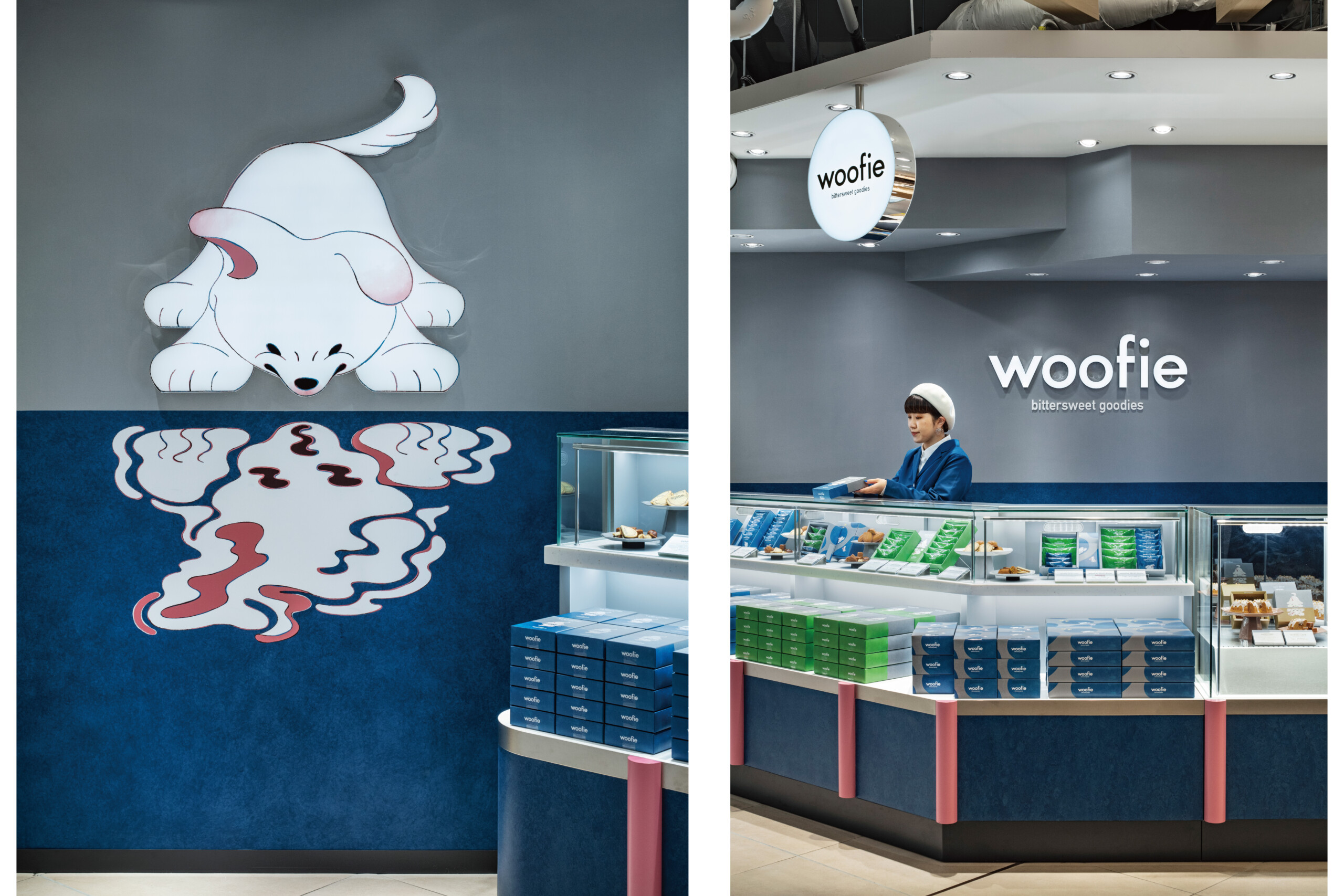
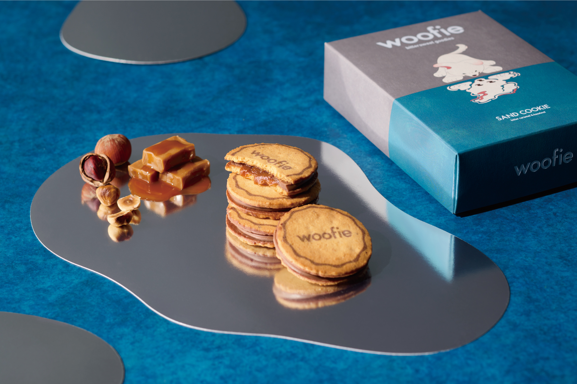
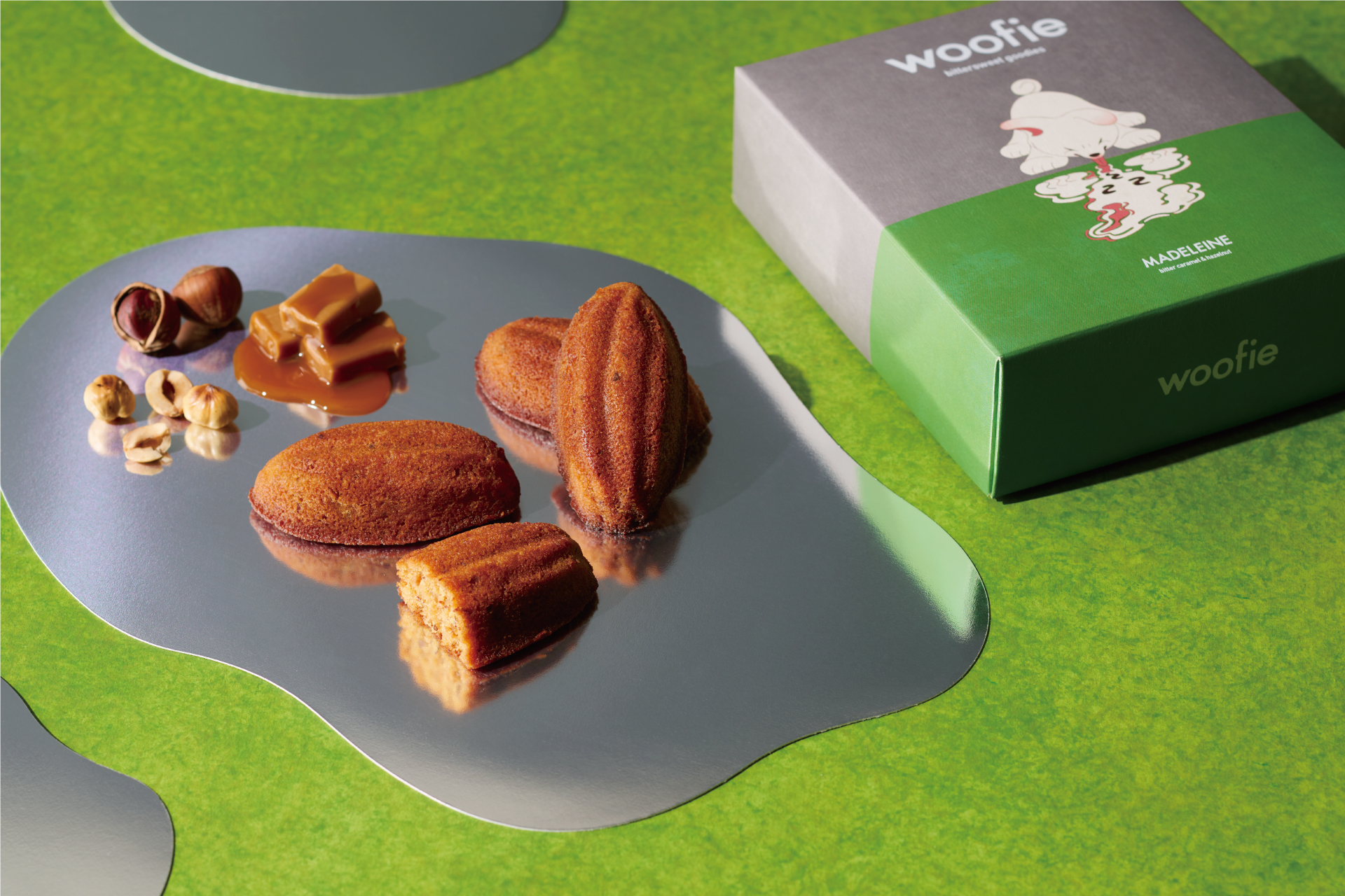
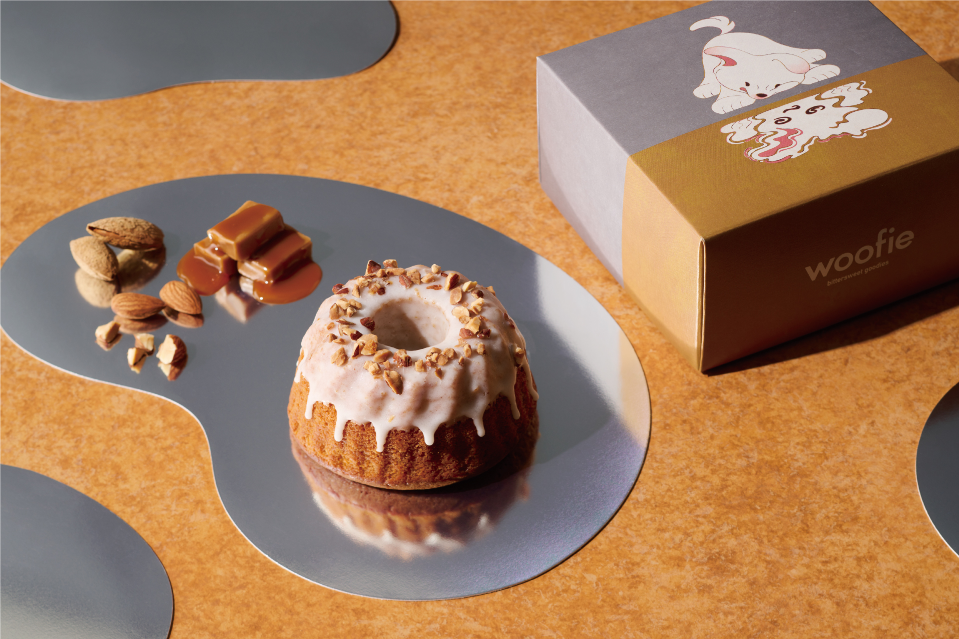
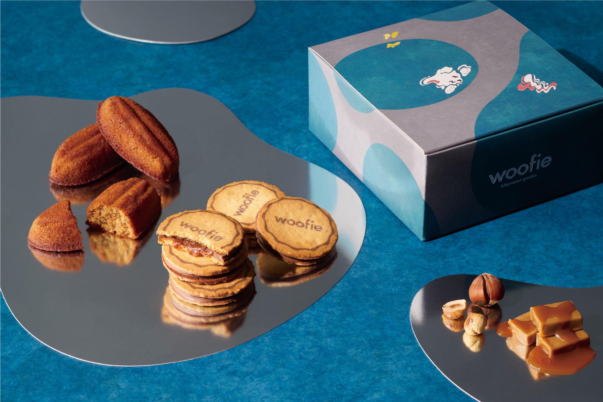


The bittersweet sweets brand "woofie," themed around caramel and nuts, has opened in the JR Shinjuku Station's underground commercial facility "EATo LUMINE." Responsible for the overall planning, art direction, and design, including product development, logo, packaging, store design, and uniforms. Despite its appearance, it's a bittersweet sweets brand that offers a slightly adult taste. The dog "Woofie" staring at its reflection in the water symbolizes the extreme contrasts of "bitter" and "sweet" flavors.